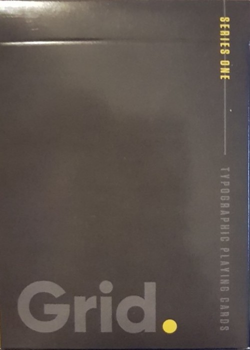
ABOUT THIS DECK
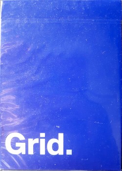
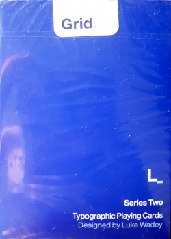
The Grid playing cards are a three part collection based on the design principals of the International Typographic Style, otherwise known as the ‘Swiss Style’ of graphic design. Series Two has been reworked from its original launch because I wanted to refine the design and bring the whole deck closer to the original concept set out by Series One. I feel now, the whole deck has a cleaner more precise and elegant look, one that is important to have in every collection.
Originally starting in the 1920s in Germany, the Netherlands and Russia, the ‘Swiss Style’ later developed in Switzerland in the 1950s. It’s main principals are readability and cleanliness, with most creations adopting an asymmetric layout, always based on the use of a grid. These grids, usually made up of hidden columns and rows, are used to align words, numbers, pictures and patterns and so each series in the Grid collection adopts these principals. The works of designers such as Ernst Keller and Josef-Müller Brockmann have been a real inspiration from a graphic point of view.
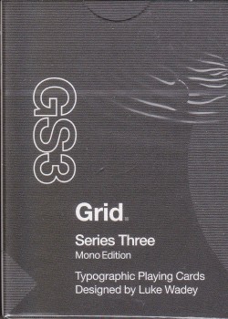
The cards are poker size and printed by USPCC but are far from traditional. These cards will be printed on linen, magic air cushion stock which I know first hand really does feel like nothing else with fully customized tuck box and seal. As a graphic designer more than an illustrator, as well as a card collector, I wanted to find a way to combine two of my biggest passions and make a collection of decks which truly stand out from the crowd. I fully appreciate the incredible work of designers of other playing cards currently in the world, I am often drawn to the cards with incredible detail and illustration. After all, I am a Kickstarter backer as well as a creator. Personally, I see the detail of my decks as ‘less is more’, doing away with traditional pips and instead adopting a typographic format, with each card acting like a miniature poster, with bold words setting the theme rather than illustration and numbers.
I have tried to keep the design minimal but functional, even the back of the card is super stripped back to just the name of the deck, with full colour bleed for real impact of colour. If, for example, you look at my version of the picture cards, they each have a diagonal line introduced as a minimal graphic, like a poster, but it replicates the diagonal line often found on traditional picture cards where the suit is duplicated and rotated. It’s a small detail but it’s my way of reflecting tradition.
With Grid Series Two, as well as vertical and horizontal alignment like in Grid Series One, I have introduced the circle to create a dial effect and explore how different grids can be adopted on playing cards. Each card has a bespoke set of alignment with the numbers and letters that sit on the edge of the circle so that they visually look to have the same alignment, whilst not always sitting in exactly the same place on each card.
Kickstarter: https://www.kickstarter.com/projects/1434465201/grid-series-three-typographic-playing-cards/description
Full Deck Scan: https://cardscans.piwigo.com/index?/category/782-grid_series_3
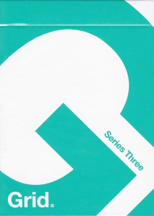
COMPANY:Typographic Playing Cards
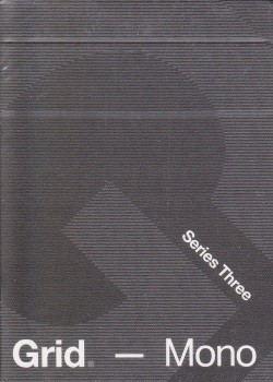
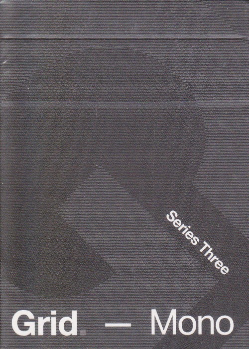
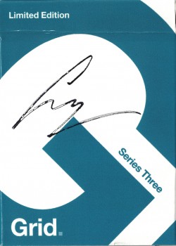
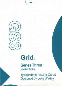
EDITION:Series Three
COLLECTIONPoker
RELEASE YEAR:2019
CARD STOCK:N/A
FINISH:Air-Cushion®
COURT ILLUSTRATION:Custom
STYLE:N/A